Interview: Robb Montgomery

Interview: Robb Montgomery
18/12/2012
"The Web is a visual medium and the journalists who can demonstrate a command of the visual, text and data story forms will emerge as the leaders of the next generation of top editors”, says Robb Montgomery, an international consultant devoted to digital journalism strategies and data journalism.
Robb Montgomery is the CEO of Visual Editors, a company which promotes visual literacy among journalists in graphics, photography, video and design. As an international media development consultant he has been helping clients in Europe and developing countries to develop digital journalism strategies and training resources. He also does data journalism, which he sees as an emerging story form that relies on databases to create interactive dashboards and visualizations from a wide range of information sources.
How does data journalism feed itself with information?
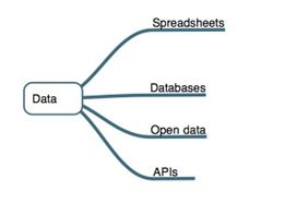
Here is an illustration that I have prepared for a book I am writing on 16 primary story forms that can be used to tell digital stories. This is a simplified view of the raw reporting ingredients that can drive data stories.

The most common form of data sourcing that journalists can get in their everyday work currently comes from spreadsheets. Government data, business data and census data are commonly available to journalists from their sources. Journalists can also create a spreadsheet from a table of figures and then sort and filter the data themselves as they gather information from their sources.
Databases consist of structured records and can be much larger and more complex than simple spreadsheet tables. Typically large databases are called ‘relational databases’ and need to hosted on servers and accessed using SQL tools. ‘MySQL’ is common server-side utility that a reporter would use to search, sort, filter, clean and export data into a form that they can use to build a chart or other type of data visualization.
Governments and organizations are making huge amounts of data available to the public as part of a global ‘open data’ movement. Journalists need to continue to push for more open data projects and also know how to make sense the data that is released to the public by these groups.
APIs or Advanced Programming Interfaces are the intelligent gateways that allow developers to bring streaming data into applications. API’s allow journalists to work with developers to build apps from rich databases. For example: YouTube and Twitter offer APIs for their services that allow programmers to build apps and based on user activity. The Guardian publishes APIs of their content and invites programmers to build apps based on their reporting.
You have trained journalists, students and journalism faculty worldwide in multimedia story forms. What do you focus on when you teach data journalism?
Usually the data journalism modules are geared around easy-to-use tools like Excel, Google Drive, Google Charts and infogr.am. The next step is to master Google Fusion Tables. I have used IBM's Many Eyes service as well as Swivel and Timetric in the past. Some of these services have gone away, gone to paid-only version or gone too long without an update.
One new service I am examining is datawrapper.de, a data visualization tool. So often, the journalists that I teach have very little actual programming or ‘power-user’ experience. I have trained many web editors, online editors, and digital managers that know how to Facebook, Google Search and cut and paste, but don't really know how to work with spreadsheets and get their data in format that can be turned into a interactive visualization. Data expertise is a huge knowledge gap in the current skill set for journalism schools. Beyond this there is a lot to teach about the forms of charts that should be used, once the data is gathered and structured properly.
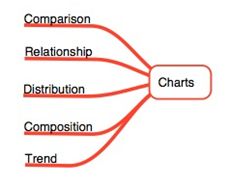
Here is another illustration from my upcoming book that shows how an understanding of basic chart forms is closely linked to learning data reporting.

Each of these chart types is actually the answer to a very simple question. “What do I need to show?”
Typically reporters tend to gather numbers that show comparisons: for example, comparing Company A’s profit to Company B’s. Or political support for Candidate A versus Candidate B.
And so on. Comparisons of numbers are typically displayed as horizontal bar charts.
The complexity arises when you learn that some charts can show more than one answer.
For example, what if you need to show composition and a comparison?
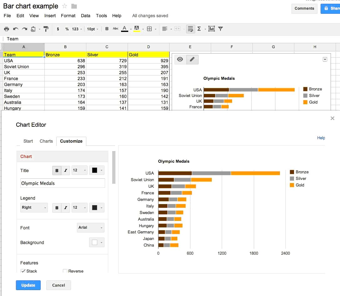
Let’s say you want to compare the Olympic medal count for the top 10 countries over a 10-year period. There are three classes of medals (gold, silver and bronze), so for each country you are comparing you also need to show the breakdown of gold, silver and bronze medals. This combination of comparison and composition is often most clearly shown in a stacked bar chart.
Here is how that data and the stacked bar chart type could be built in Google Drive:

Google Drive is a great service to teach, as it is possible to finally get professional-looking charts into articles with a minimum of effort.
Once a journalist can master spreadsheets and charts, they can begin to expand into mapping, visualizations, Fusion tables, animations, apps and other data story forms that currently require some degree of programming knowledge and talent.
Can you share some examples of stories your students did using methods and tools of data journalism?
Sure. Here are a few links from Radio Free Europe / Radio Liberty stories. These were made by journalists who have attended trainings recently. Look at these story examples from Svaboda in Belarus. These articles contain simple, but attractive charts that elevate the numbers from standard political and business stories into articles that will become memorable for readers. If you have numbers to report then there is no reason you can’t have a ‘picture with every story.’
Should every journalist be a data journalist nowadays?
Every journalist needs to recognize that there at least 15 highly effective story forms beyond text that they can use to tell stories online. Data is but one. In addition to data, there are several other story forms that digital journalists need to be fluent in. Some of the most useful (regardless of platform) is the ability to tell a richly layered story in audio and to smartly tell a story in visual sequences. Once fluency is mastered in these elemental forms, a reporter can learn to tell non-linear stories using timelines, maps, interactive images, immersive images and many other emerging digital story forms.
Is visual representation of information getting more important than the actual textual narration online?
For stories with reporting numbers, data visualizations and charts are the way to show the impact of those numbers. Simply put, the Web is a visual medium and the journalists who can demonstrate a command of the visual, text and data story forms will emerge as the leaders of the next generation of top editors.


